We are nearing the end of our series on the new WCAG 2.1 Success Criteria. We return to the topic of mobile accessibility with the last two new success criteria, both at level AAA. This post will review 2.5.5 Target Size under guideline 2.5, Input Modalities.
Guideline 2.5 Input Modalities
Make it easier for users to operate functionality through various inputs beyond keyboard.
2.5.5 Target Size (Level AAA)
The size of the target for pointer inputs is at least 44 by 44 CSS pixels except when:
- Equivalent: The target is available through an equivalent link or control on the same page that is at least 44 by 44 CSS pixels;
- Inline: The target is in a sentence or block of text;
- User Agent Control: The size of the target is determined by the user agent and is not modified by the author;
- Essential: A particular presentation of the target is essential to the information being conveyed.
Overview
This success criterion addresses issues when interacting with mobile devices. The goal is to make controls large enough to see and touch. This helps people with tremors or mobility disabilities to activate the control.
A size of 44 by 44 pixels corresponds to a 9mm square on a typical mobile device. This size is large enough for most people to see and touch using a finger or alternative pointing device. The size is similar to the Apple iOS and Android user interface guidelines for size of controls.
The Finer Details
Interfaces can still have controls smaller than 44 by 44. But, in that case, there must be another control to perform the same operation that is at least 44 by 44 pixels.
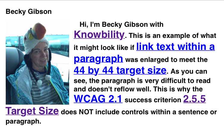
Links are controls. It does not make sense to have linked text within a sentence be larger than the surrounding text. So, controls within a sentence or paragraph are not included in this guideline. Footnote or help links at the end of a sentence are also exempt. The image below simulates a paragraph that has the link text enlarged to meet the 44 by 44 target size. This makes the paragraph too hard to read and can also affect the reflow if the view resizes.

Standard HTML controls such as the button, select, and checkbox elements are not affected by this success criterion if their appearance is not changed from what browsers display. Use the standard interface controls and you don’t have to worry about this issue.
And finally, if the size of the control is necessary to present the information, it is acceptable for it to be smaller than 44 by 44 pixels. An example is an app that helps users increase selection accuracy by slowly decreasing target size for the user to activate.
Example
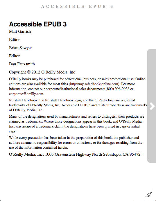
The following image of a page in an e-book reader shows two different methods to turn the page. There is a very small page turn icon at the bottom right corner of the page. It is less than 44 by 44 and would fail this success criterion. There is also a highlighted grey vertical rectangle along the right margin which contains a right pointing chevron. The chevron character is larger than 44 by 44 pixels and satisfies the size requirement. The chevron character is also more familiar to people who may not understand the page turn icon. Thus, we have a double win—we have also aided cognitive accessibility!

Who Benefits?
People who find it hard to accurately touch a control benefit from the larger size. This includes people who use an alternative pointer such as a head mouse or mouth stick. Additionally, everyone benefits because a finger is not as accurate as a mouse pointer. It can sometimes block the user’s view of a very small control.
Takeaways
Make sure the size of controls are at least 44 by 44 pixels. Remember, bigger is better in this case! Use standard controls whenever possible. And, if you want to use very small controls, make an alternative, larger control available as well.
